No issues found on this screen.
Summary
We reviewed the Figma design of the Houston Airports iOS app on April 21, 2026, on behalf of Houston Airport System. This quickscan highlights the most visible accessibility issues in the current design. The report outlines what needs attention and how it can be resolved before the design moves into development.
Commissioned by

-
Passed
-
Failed
55
Total
- passed
Impact
Minor: 0
Medium: 0
Serious: 0
Type
Content: 0
Technical: 0
Perceivable
- of 20
Operable
- of 20
Understandable
- of 13
Robust
- of 2
Failed success criteria:
About this audit
- Evaluated by
- Proper Access
- Commissioned by
- Houston Airport System
- Software supplier
- iOS (Figma design)
- Report date
- April 21, 2026
- Standard
- WCAG 2.2
- Methodology
- WCAG-EM
Scope of the audit
- The iOS app redesign for Houston Airports, reviewed in the Figma design file
Out of scope:
- Native behavior that cannot be verified from a static design file
- Content coming from third parties
Accessibility support baseline
- Figma (design review)
- iOS Human Interface Guidelines
- Apple accessibility conventions (Dynamic Type, VoiceOver)
Technologies of the website
- Figma
Progress on resolved findings
Collaborate with your team
Export all findings as a CSV file. You can load it into an (online) spreadsheet to collaborate with your team.
Import into Jira
Export all findings as a Jira-compatible CSV file. You can import it directly via Jira > Issues > Import issues from CSV.
Track in your browser
Keep track per finding of whether it has been resolved. Your progress is stored in your own browser. No one else can see your result.
0 of
0 resolved
Issues found
Filter findings by:
Impact:
Type:
Status:
No findings match this filter.
No issues found on this screen.
#1 - Insufficient color contrast of the search bar
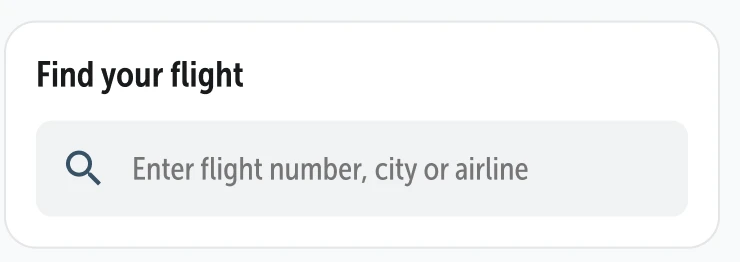
A search bar is present on this screen. The contrast ratio between the gray (#F1F2F3) background and the white page background is 1.1:1. The same issue occurs on other screens, e.g. Flights.
User story
As a visitor with low vision, age-related contrast loss, or a screen in bright sunlight, I need the border of every input field to keep at least 3:1 contrast against the page background — because the border is what tells me "this is a field you can type into", and a border I cannot see leaves me with an invisible form field I do not know is there.
Solution
The current contrast does not meet the minimum requirement of 3:1 for input field boundaries against adjacent areas. There are three possible fixes:
- Increase the contrast of the gray background against the white page.
- Give the input field a dark border (at least 3:1 contrast against white).
- Increase the contrast of the placeholder text.
The best approach is to apply all three.
#2 - Text is clipped at 200% magnification
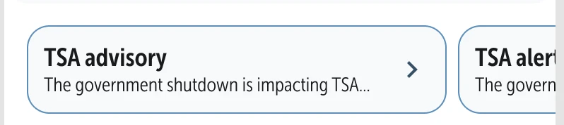
On this screen, the text in the second card is not fully visible. Text must remain fully readable without scrolling in the reading direction.
User story
As a visitor with low vision who has set my phone's text size to the largest option so I can actually read the interface, I need every text in the app to remain fully visible at that size — because when text gets clipped or hidden behind other elements, I can see half a word or half a sentence but not the rest, and I have to guess what it said or give up.
Solution
Make sure text containers grow, wrap, or scroll to accommodate larger text sizes. Avoid fixed heights and widths on text-holding views, avoid maxLines / lineLimit without a scroll fallback, and use Dynamic Type (iOS) or sp units with android:textSize (Android) so text respects the system setting. Test every screen with the phone's largest text size in both portrait and landscape to confirm that no text is clipped, truncated, or hidden behind other elements.
#3 - UI element contrast is below 3:1

On this screen, the gray (#B9C3D0) buttons in the dot navigation have a contrast ratio of 1.8:1 against the adjacent color (#FFFFFF). User interface components and meaningful graphics must have a contrast ratio of at least 3:1 against adjacent colors so users with low vision can recognize and locate them.
User story
As a visitor with low vision or color blindness, I need to tell where buttons, form fields and icons are on the screen — because when they barely contrast with their background, I cannot spot them at a glance, I tap around blindly looking for them, and I keep missing the targets I meant to hit.
Solution
Adjust the color of the element or its background so the contrast ratio is at least 3:1. Apply this to every state that conveys information (default, focused, selected, checked) and in both light and dark mode. Verify the ratio with a contrast checker.
#4 - Touch targets are too small or too close together
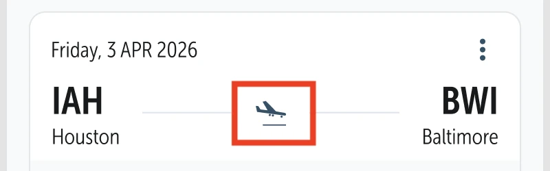
On this screen, the buttons in the dot navigation are smaller than 24×24 CSS pixels, or the adjacent targets are packed so tightly that their effective tap areas overlap. Targets that are too small — or too close to neighboring targets without enough spacing — cause mis-taps for users with limited fine motor control.
User story
As a visitor with a tremor, with limited fine-motor control, or who uses my phone one-handed on a moving train, I need touch targets that are large enough and spaced apart enough that I can tap them reliably — because when buttons are tiny or jammed against each other, I keep activating the wrong control, every mis-tap sends me to a screen I didn't want, and I lose confidence that the app will do what I ask it to.
Solution
Give every touch target an effective size of at least 24×24 pt (iOS) / 48×48 dp (Android) — Apple and Google both recommend 44×44 pt / 48×48 dp as the comfortable minimum. Space compact targets apart, and group active elements that share the same destination into one single target.
#5 - Text contrast is below the minimum

On every screen, the navigation buttons in the lower tab bar have a text label. The active button in the blue theme has blue text (#4A8FBF) with a contrast ratio of 3.5:1 against its background. The active button in the green theme has green text (#4A8F3F) with a contrast ratio of 4:1 against its background.
Normal text must have a contrast ratio of at least 4.5:1, and large text (18pt and larger, or 14pt bold and larger) must have a contrast ratio of at least 3:1.
User story
As a visitor with low vision, color blindness, or one reading outdoors in bright sunlight, I need text to stand out clearly from its background — because when the contrast is below the threshold the text blurs into the background, I have to squint or zoom and even then I lose words, and I end up giving up on the screen entirely.
Solution
Adjust the text color, the background color, or both, so the contrast ratio meets the minimum. Check the result with a contrast checker and verify it for every state the text appears in (default, disabled, over images, on colored backgrounds) and for both light and dark mode.
#6 - The active dot is indicated by color only
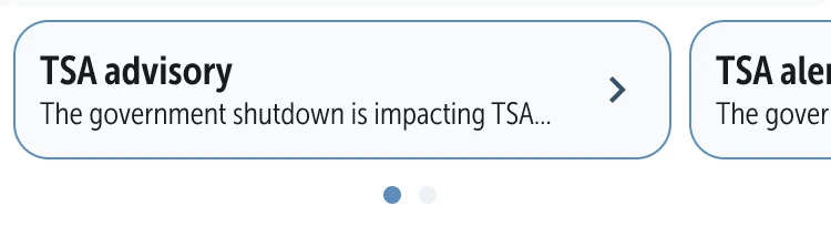
On this screen, the dot navigation uses only color to indicate the active dot.
User story
As a visitor who is color blind, who has low vision, or who uses a high-contrast theme, I need the active dot in carousel navigation to be marked by more than color alone — and for any color difference to meet at least 3:1 contrast — for example with a larger size, a filled vs hollow shape, or a border — because right now the only difference between the active dot and the others is a color change too subtle to see, and I cannot tell which slide I am currently on.
Solution
Give the gray dot at least 3:1 contrast against the white background. To ensure the active dot is clearly distinguishable, either:
- Increase the color contrast: raise the contrast ratio between the active dot's color and the background to at least 3.0:1.
- Use a non-color indicator: change the shape or size of the active dot to differentiate it. For example, make the active dot larger, add an outline, or use a different shape.
#7 - Contrast of the loader animation is too low

The loader animation icon has insufficient contrast between the icon and the background. The contrast ratio of the darkest blue (#71B7E2) line is 2.2:1, which is too low. This makes the icon difficult or impossible to see for some users, especially those with low vision or color blindness. Additionally, if the icon is intended to serve as a visual label for an input field, the low contrast means it is not a valid visual label.
User story
As a visitor with low vision, age-related contrast loss, or a screen in bright sunlight, I need the icon on every icon-only button to keep at least 3:1 contrast against the button background — because the icon is the only indication of what the button does (there is no text label), and an icon I cannot see is a button I cannot use.
Solution
Ensure that the icon has a contrast ratio of at least 3.0:1 against its background.
No new issues on this screen.
No new issues on this screen.
About this audit
Purpose of This Report
This evaluation provides an overview of the extent to which the tool currently complies with WCAG 2.2, levels A and AA. The Web Content Accessibility Guidelines (WCAG) are international guidelines for web content accessibility. These guidelines are divided into four principles: Perceivable, Operable, Understandable, and Robust, each with specific measurable success criteria.
Testing Process
This evaluation was conducted following the WCAG-EM reporting methodology. The following process was used:
- Determining what is in and out of scope
- Identifying the technologies in use
- Compiling a sample
- Evaluating the sample
- Documenting identified issues
The evaluation covers all requirements from the European accessibility standard EN 301 549 (WCAG 2.2).
The majority of the evaluation is a manual process. However, some criteria are supported using automated tools, such as axe-core and Chrome Developer Tools.
Fine Print
Since the evaluation is based on a sample, some issues may go unnoticed and could be assessed differently in subsequent evaluations. The sample is representative of all content on the tested domain. The evaluation provides a snapshot; when implementing improvements, new accessibility issues may arise.
The assessment of each criterion is based on a falsification approach: “compliant” means that we found no reasons to assess it as “non-compliant.”
For each issue, we provide up to three examples. The same issue may appear in multiple locations. Use this report as a blueprint to check all parts of the website.
How does this report work?
Viewing and filtering findings
All accessibility issues we found are listed under Issues found. You can filter the findings by:
- Impact (Serious, Medium, Minor, Advice) — how severe is the problem for the user?
- Type (Content, Technical) — does the content or the code need to change?
- Status (Open, Resolved) — which problems have already been fixed?
Tracking progress
You can track your progress in two ways:
- CSV export — export all findings as a CSV file and load it into an (online) spreadsheet to collaborate with your team.
- Jira export — export all findings as a Jira-compatible CSV file. Import it via Jira > Issues > Import issues from CSV. Findings are created as bugs with a priority based on impact.
- Track in the browser — enable this option to keep track per finding of whether it has been resolved. Your progress is stored in your browser. No one else can see your result. Note: the progress is tied to your browser. If you use a different browser or device, the count starts over.
- Action plan — download a prioritised action plan to resolve the issues step by step. This is available for audits from March 2026 onwards.
Sharing a link to a specific finding
A link icon appears at each finding when you hover over it. Click this icon to copy the direct link to that finding. You can paste this link into an email or chat message, for example to ask Proper Access a question about a specific point.