What makes a good accessibility report?
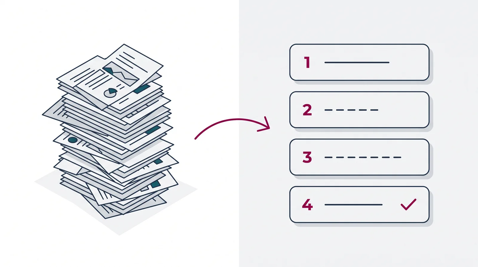
An email lands with the subject line “Accessibility report, final version”. You open the attachment: 73 pages, full of success criteria, ARIA labels, alt text and contrast ratios. You read a few lines, close the document and think: I’ll get to it tomorrow.
Tomorrow becomes next week. Next week becomes next quarter. And the question stays: what are you actually supposed to do with all this?
If that sounds familiar, it’s usually not your fault. It’s the report. Most accessibility reports are written for the auditor who makes them, not for the team that has to work with them. So nothing happens with it, however good the research underneath may be.
You can write up that same research in two ways. One version nobody reads. With the other, your team starts the next day. It comes down to how the findings are ordered, what language they’re written in, and whether there’s a plan alongside them. Across 950 audits I’ve seen what makes that difference. Below I’ll show you what to look for, and how a good report gets you to an accessible website.
The problem with traditional reports
Most accessibility reports aren’t written with you in mind. They follow the structure of the WCAG guidelines, organised by success criterion. First all the findings for criterion 1.1.1 (non-text content), then 1.3.1 (info and relationships), and so on.
That creates two problems.
The first: an ordering like that is hard to turn into action. A single website component is described across several success criteria. Before you can start fixing anything, you have to pull all the pieces together. That takes time.
The second: it’s overwhelming. 50+ pages, a lot of findings, 55 different success criteria. Where do you start? Often nowhere, and then your website stays inaccessible.
A better starting point: reports by page and by element
It gets much easier when every problem is grouped by web page and by element.
Per element, every problem found in that element is written down.
With a screenshot of the problem, the current code and a concrete solution. A content editor gets that solution in plain, non-technical language and a developer gets it as a code snippet:
/* Current situation */
.logo-text {
  color: #767676;
  background: #ffffff;
}

/* Accessible solution */
.logo-text {
  color: #595959; /* contrast: 4.6:1 */
  background: #ffffff;
}
That tells you straight away where you need to be, instead of working it out yourself. But even with a good report, the question remains: how do you tackle it? In four steps.
Step 1: Don’t read the report front to back
Start with the management summary. That’s where the overview is:
- how many findings there are in total;
- how they’re spread across impact, from critical to low;
- which people with disabilities are most affected.
It helps a lot if your report lets you filter to a selection of findings that fall under content or technology, or that have high impact.
Step 2: A plan of action and a presentation
A good report includes a plan of action: a document that gives more context on the overall state of your website, with a concrete plan for each team: editors, designers, developers.
If you want to show the audit results to everyone involved, you’ll want the presentation that holds the core of the research, together with the main problems and the work plan.
Using project software? Then a CSV export is handy for loading all findings straight into your project tool.
Step 3: The findings
When you read a problem in the report, you should immediately understand what’s wrong and for whom.
The user stories, the account of a user with a disability, give a dry description an extra dimension and do more to motivate your team to fix the problems.
Screenshots help you see where the problem sits. So not a screenshot of the element itself, your logo for instance. You know perfectly well what your logo looks like. Take a screenshot of the problem instead, the alt text of the logo for example.
A solution matched to the team that has to carry it out, with concrete tips, helps you reach an accessible result quickly.
Step 4: Test, and test again
Ideally you don’t just have information about a specific element, you also know how to find similar problems on other pages. The more you can test yourself, the less dependent you are on an external auditor. A good report helps you understand not just what’s going wrong, but also how to spot it yourself.
For a quick check of your own in between, you can put the free WCAG Radar on your page. It shows right on screen whether contrast, headings, focus and accessible names hold up, so you can see straight away whether your change had the intended effect before you request a retest. It doesn’t replace a test with a screen reader or with real users, but it saves a lot of back and forth.
Because that last part matters most: test with real users. People with disabilities tell you whether your solution works in practice, not what you think they need.
When do you ask for help?
Accessibility is a complex field, you have to work at it full time and for years to know a lot about it. Ask for help when you don’t know how to fix a finding, when your solution creates new problems, when your team is stuck, or when you’re unsure whether you’re interpreting a guideline correctly.
A lot of organisations think: we have a report, we’ll figure it out ourselves. But the report is the starting point. The value is in what comes after: understanding, prioritising, fixing and testing. And that goes faster with someone who has done it hundreds of times.
Track the market with the EAA monitor
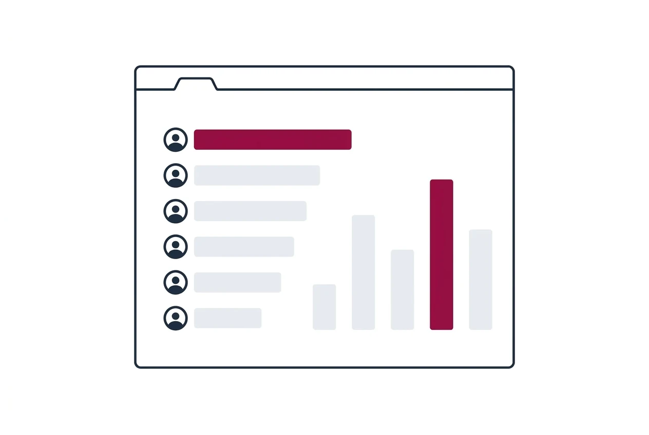
You’re not on your own. With our EAA monitor you get insight into how other companies are dealing with the European Accessibility Act. You ask your questions anonymously, you read back the answers and experiences of other companies, and you find help from proven experts in digital accessibility. That way you see where you stand compared to the rest, and you know where to turn as soon as you get stuck. Take a look at eaa-monitor.nl.
From report to result
Want to know where to get a report like the one I’ve described above? Get in touch with my colleague Phi at [email protected] or take a look at the accessibility audit page.