Blog
Articles about WCAG, the European Accessibility Act, and practical tips for developers and content creators.
SC 4.1.3 - What does "Status Messages" mean?
You add something to your basket. The little number next to the cart icon goes from 2 to 3. Nothing else happens: no page reload, no focus change, no confirmation you have to dismiss.

Tables: the part of SC 1.3.1 that breaks most often
Opening hours. Monday, 09:00 to 17:00. You look at it once and you know which time belongs to which day, because the two sit on the same row.
What is an accessible name?
Turn on a screen reader and move to a button. You hear two or three things: “Add to basket, button”. The word “button” is the role. “Add to basket” is the accessible name.
SC 2.4.4 - What does "Link Purpose (In Context)" mean?
Screen reader users have a shortcut that sighted visitors do not: pull up a list of every link on the page and jump straight to the one you want. It is fast and it is how a lot of people actually browse. Now imagine that list on a typical news site. Fourteen entries, all reading “Read more”. Success criterion 2.4.4 exists to stop that: the purpose of a link must be clear.
SC 1.4.3 - What does "Contrast (Minimum)" mean?
Light grey text on a white background looks calm and modern. Put a bit of sunlight on the screen and it is gone. For visitors with reduced vision it is not gone occasionally, it is gone always. That is why WCAG says: text needs enough contrast with its background.
SC 1.3.1 - What does "Info and Relationships" mean?
You can see that a line is a heading because it is big and bold. You can see that three lines belong together because they each start with a bullet. You can see which column a number belongs to because it sits underneath the word “Price”. None of that is visible to a screen reader. It only knows what the code says. Success criterion 1.3.1 is the rule that closes that gap: the structure a sighted visitor perceives must also be available in the markup.
SC 1.1.1 - What does "Non-text Content" mean?
Every image on your site is invisible to somebody. Not because their screen is broken, but because they browse with a screen reader, or because the image failed to load on a train, or because they turned images off to save data. What reaches them is whatever you typed into the alt attribute. That is the whole point of the first success criterion in WCAG: anything that is not text needs a text alternative that does the same job.
Why every finding in our audit reports starts with a user story
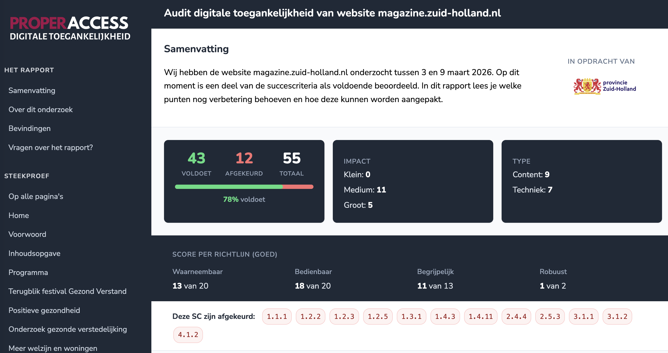
Atlassian writes about user stories: “A user story puts end users first. After reading a user story, the team knows why it is building, what it is building, and what value it creates.” We took that idea and asked: what happens if you apply it to an accessibility audit report? The answer turned out to be straightforward. The report becomes readable for everyone who has to act on it, not just the auditor who wrote it.
Can AI see that your text is too light?
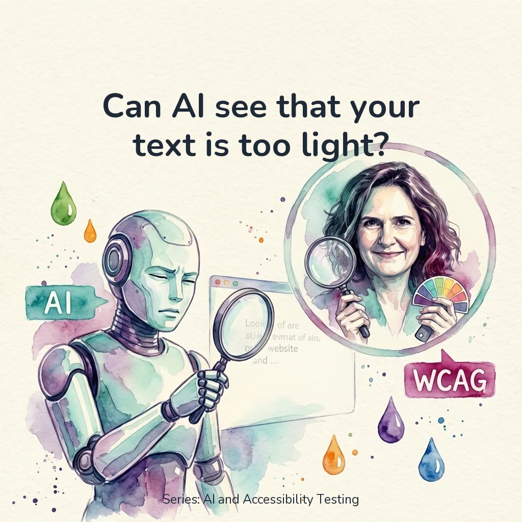
Can AI see that your text is too light? Green on white. Orange on white. Light gray on white. It looks fresh. Colorful. Modern. But for someone with low vision, that text disappears into the background. And it’s not just older people. On a screen in sunlight or during a busy day, light text is the difference between reading and giving up. This is the most common contrast problem I encounter in audits (WCAG 1.4.3). Nearly every website has it somewhere. Often in exactly the elements that make the design feel “fresh” and “modern.” In the previous test, I gave AI a piece of code. This time I’m doing something different: I’m giving AI a screenshot of a real website. No code, no HTML, no CSS. Just an image. Can AI vision see what’s wrong?
AI test: Can AI detect a div pretending to be a button?
Can AI detect a div pretending to be a button? A <div> with an onclick. Looks like a button. Does something when you click it. But press Tab and nothing happens. Enter? Nothing either. For a keyboard user, this button doesn’t exist. This is the number 1 keyboard issue I encounter in audits (WCAG 2.1.1). And the easiest to fix: replace the div with a <button>. But can AI find this problem too? And not just in a code snippet, but on a real, live website?
Can AI test your website for accessibility? I'm going to find out
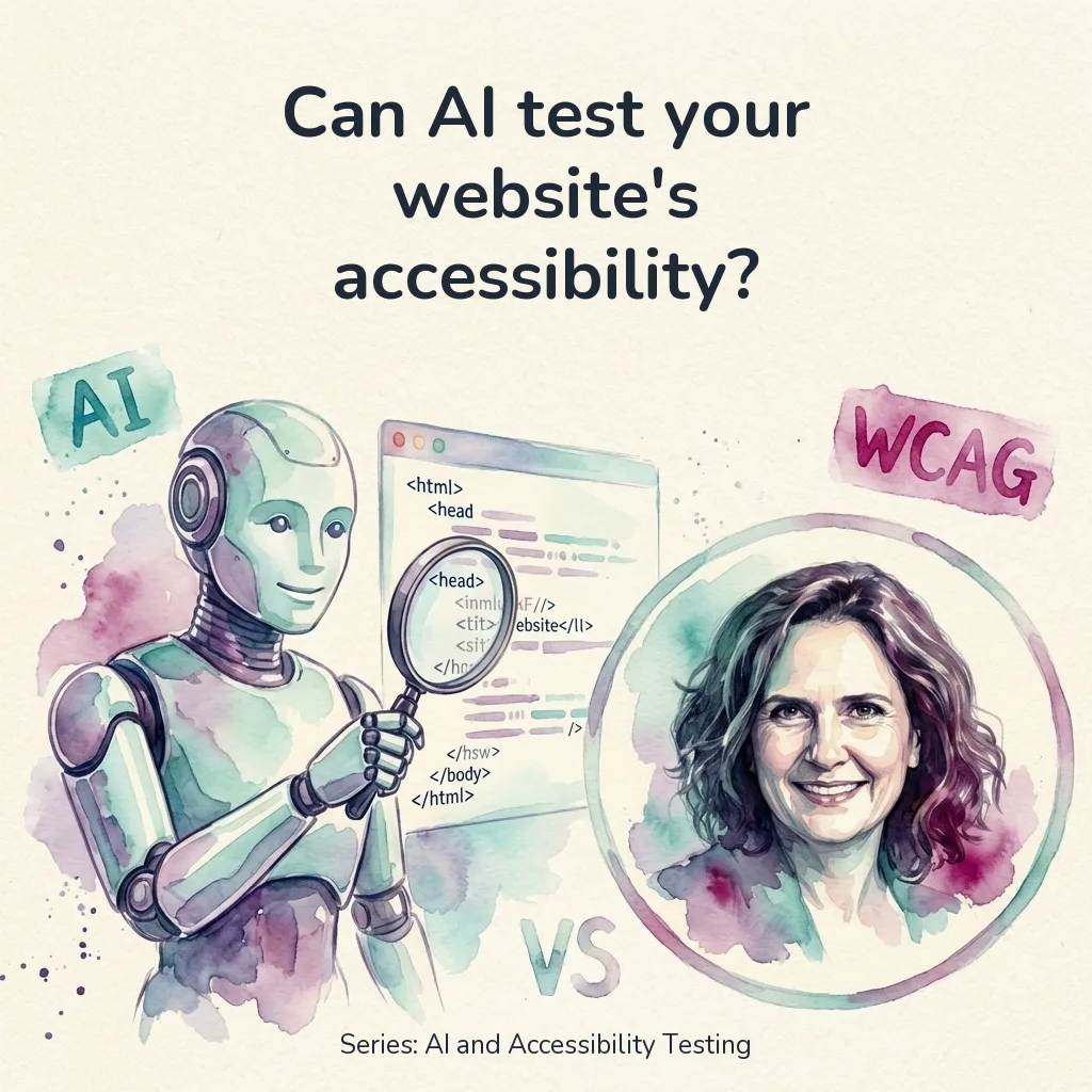
Can AI test your website for accessibility? “Can’t ChatGPT just check my website?” I hear this question more and more. From developers who want their code reviewed. From product owners without the budget for a full audit. From e-commerce owners who really should have been EAA-compliant yesterday. It’s a fair question. AI can write code, grade essays, and analyze medical scans. Why wouldn’t it be able to spot that your contrast ratio is too low, or that your button has no accessible name? The short answer: AI can do quite a lot. It’s getting smarter by the day. But there are limitations and drawbacks. The longer answer? That depends on what exactly you want to do, which tools you use, how much you’re willing to pay, and how long you’re willing to wait. In this series, we’re going to find out. Over a series of articles, I’ll test exactly what AI can and can’t detect when it comes to accessibility issues. No theory, no assumptions. Real tests with real code.