Can AI see that your text is too light?
Green on white. Orange on white. Light gray on white. It looks fresh. Colorful. Modern.
But for someone with low vision, that text disappears into the background. And it’s not just older people. On a screen in sunlight or during a busy day, light text is the difference between reading and giving up.
This is the most common contrast problem I encounter in audits (WCAG 1.4.3). Nearly every website has it somewhere. Often in exactly the elements that make the design feel “fresh” and “modern.”
In the previous test, I gave AI a piece of code. This time I’m doing something different: I’m giving AI a screenshot of a real website. No code, no HTML, no CSS. Just an image. Can AI vision see what’s wrong?
The test
I took a screenshot from the Divi website (a popular WordPress theme builder). It shows four columns on a white background:
- “WEB DESIGN AGENCIES” in purple
- “WEB DESIGN FREELANCERS” in blue
- “SMALL BUSINESS OWNERS” in green
- “ONLINE STORE OWNERS” in orange
Below each heading is body text in a darker color. Above them are decorative illustrations in matching colors.
I gave this screenshot to Claude with the question: “What contrast issues do you see on this web page?”
No hints. No color values. Just the image.
What AI found
Claude identified three categories of contrast issues.
1. Green heading: fails
“Green is the most problematic hue for contrast against white. A typical green like #4CAF50 only achieves about 2.5 to 3.2:1 against white.”
Score: Not found. I measured the actual green used in the heading as #2CD991 on a background of #F0FBF5. My contrast value is 1.7:1. That’s too far off from Claude’s estimate of 2.5 to 3.2:1. And the margin of 0.5 between 2.5:1 and 3.0:1 is simply too wide to accept. WCAG measures contrast to two decimal places, for example 2.99:1.
2. Orange heading: fails
“Orange is also a problematic hue. A typical orange like #FF9800 achieves about 2.9:1 against white. Even a darker orange like #F57C00 only reaches about 3.6:1.”
Score: Not found. Wrong again. Claude measures a different shade of orange and doesn’t notice that each block on the screenshot has a subtle background color. My measurement is #FC7519 on #FDF4EF with a result of 2.5:1.
3. Body text in light gray: fails
“A typical light gray in this kind of design is #888888 to #AAAAAA. That gives a ratio of 2.3 to 3.5:1. That fails the required 4.5:1.”
Score: Not found. Claude sees light gray body text on this screenshot. I see body text in dark tones that all meet the minimum contrast requirements.
4. Purple heading: borderline
“A typical Divi purple achieves about 4.5-5:1 against white. That’s on the border.”
Score: Found. Claude is uncertain and rightly says it should be verified with a color meter. That’s an honest answer. My measurement is #9534EC on #F6F0FE with a contrast of 4.7:1. I don’t find it acceptable that my software is uncertain about something.
5. Blue heading: likely passes
“A medium blue typically achieves sufficient contrast against white.”
Score: Found. My measurement is #2372FF on #F4F6FF with a result of 4.0:1.
6. Decorative illustrations: correctly ignored
Claude correctly reports that the illustrations are decorative and don’t fall under WCAG 1.4.3. Good that it doesn’t raise a false alarm.
The scorecard
| Element | AI verdict | My measurement | Score |
|---|---|---|---|
| Green heading | “Fails, ratio ~2.5-3.2:1” | #2CD991 on #F0FBF5 = 1.7:1 | Not found |
| Orange heading | “Fails, ratio ~2.9-3.6:1” | #FC7519 on #FDF4EF = 2.5:1 | Not found |
| Body text | “Fails, ratio ~2.3-3.5:1” | Dark tones, passes | False alarm |
| Purple heading | “Borderline, verify” | #9534EC on #F6F0FE = 4.7:1 | Found |
| Blue heading | “Likely passes” | #2372FF on #F4F6FF = 4.0:1 | Found |
| Decorative illustrations | “Not applicable” | Correctly ignored |
2 out of 6 correct, 2 with wrong ratios, 1 false alarm, 1 correctly ignored.
What stands out
Claude interprets the colors from my screenshot with different results than my manual test.
It seems that Claude can’t measure well. It gives no exact ratios, only estimates based on “typical” color values. It says “a typical green achieves 2.5-3.2:1,” but it doesn’t know which green Divi actually uses. For an audit, you need a color meter.
This is striking. Yesterday I had to install something on my iPhone and at some point didn’t know which option to choose. I took a screenshot and gave it to Claude. It immediately knew which option I should pick. In those cases, Claude is enormously helpful. Apparently not when measuring contrast.
Where AI vision falls short
Exact ratios. Claude estimates, but a manual test gives you the precise number. For a report, you need those exact figures.
Hover states, focus states, dark mode. A screenshot is a snapshot. What’s the contrast when you hover over a heading? In dark mode? Claude can’t assess that.
Text on photos and gradients. When text sits over a photo or gradient, contrast varies per pixel. Claude can give an impression but not a reliable measurement.
Large text vs. regular text. Claude correctly mentions that large text (18pt or 14pt bold) has a lower threshold (3:1 instead of 4.5:1). But it can’t determine how large the text actually is in pixels from a screenshot. That’s the difference between “fails” and “passes” for the orange heading.
AI vision vs. automated tools
| Automated tool (axe) | AI vision (Claude) | |
|---|---|---|
| Exact ratio | Yes, to the decimal | No, estimation |
| Knows which colors are problematic | No, just calculates | Yes, knows the patterns |
| Text on photos | No, can’t measure it | Yes, can visually assess |
| Hover/focus states | No, unless you trigger that state | No |
| Explanation of why it’s wrong | Minimal | Yes, with context |
| Speed | Milliseconds | Seconds |
| Cost | Free | API cost per screenshot |
For standard contrast checks, an automated tool is faster, free, and more precise. But AI vision understands the design context. It knows that “fresh green on white” is a recipe for contrast problems, and can explain that in a way a designer understands.
The rule of thumb
Any gray shade lighter than #767676 on white fails. Remember that one color code.
And for colors: always test green, orange, and light blue on white. Those three fail most often.
| Color on white | Ratio | Passes? |
|---|---|---|
| #4CAF50 (green) | 2.9:1 | No |
| #FF9800 (orange) | 2.9:1 | No |
| #2196F3 (blue) | 3.3:1 | No (regular text) |
| #7B1FA2 (purple) | 6.6:1 | Yes |
| #999999 (gray) | 2.8:1 | No |
| #767676 (gray) | 4.5:1 | Yes (right on the threshold) |
What I learned from this
AI vision doesn’t reliably recognize contrast issues on a real website. It knows which color combinations are typically problematic, understands the WCAG rules, and can nuance about edge cases. It correctly ignores decorative elements.
I can imagine giving Claude your full CSS to flag problematic colors. But a color is never problematic on its own. It’s always about a combination of two colors. It becomes a lot harder and more expensive to test all combinations across all pages.
For an audit, you need exact ratios. AI vision is a supplement, not a replacement. It works best as a first screening: let AI assess a screenshot, then use a tool for the exact numbers.
And just like the previous test: AI sees a snapshot. It doesn’t see what happens on hover, in dark mode, or at 400% zoom.
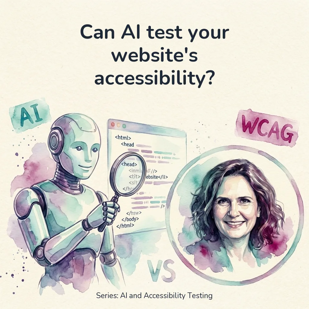
This is a test from the series “AI and Accessibility Testing.” Each test examines whether AI can detect a specific accessibility issue. Want to know how accessible your website is? Have it tested by a human for the best results. Get in touch.